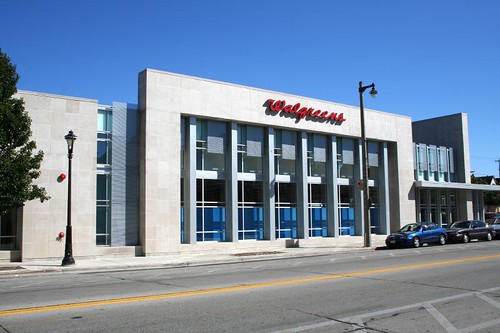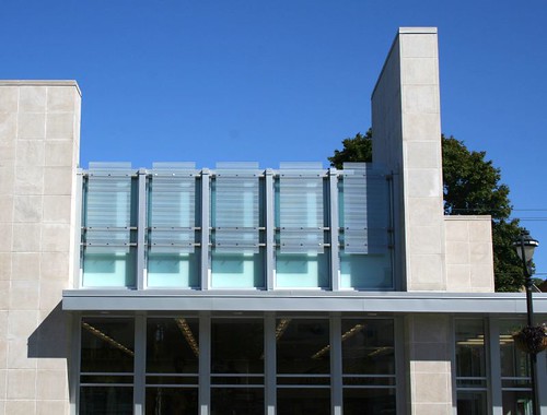
A recent Journal-Sentinel column praised the design of the new East Side Walgreens on Oakland Avenue. I agree, as a building, it's pretty sweet -- it's a set of bold forms, with some nice accent detailing (it's forbidden in these Modern days to call it "ornament" even though that's exactly what it is, but that's a subject for another post.) It's pleasing to look at, and a big, big step up from a typical suburban outlot Walgreens.

But it's still a Walgreens. It still means we lost our neighborhood grocery store, the only one within easy walking distance for thousands of UWM students and neighborhood residents. It still replaced a functionally identical Walgreens just a block south.
But I've griped about that before. It was a business transaction, among consenting private entities; the fact that it screwed the entire neighborhood.... well, that's just tough luck for us, right? Free market and all that. Me, I've been doing my best to avoid the Oakland Walgreens since last summer, when they killed off our Sentry.
For the present, here are a few other notes:
- The bike racks, which I had understood to be respectfully placed within the brick wall recesses along the sidewalk, are in fact located nearly at the back of the lot, on a sidewalk alongside the store -- a clear statement that they were an afterthought, not a priority. Similar non-consideration was given to the propane tank storage, a crude metal cage plopped on the sidewalk (and closer to the entrance than the bike racks.)

- I can scarcely fathom how enormous the parking lot is, especially for its highly urban location. I wonder if it will ever be anywhere close to full. I wonder if Walgreens has any statistics on how many of their customers arrive on foot or by bicycle. But hey boy, lookit that there green space!! That's what Oakland & Locust really needed -- not more businesses, not apartments, but some fantastic green space. After all, it's an arduous five hundred foot walk to the nearest major urban park.
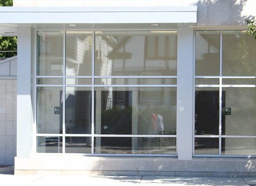
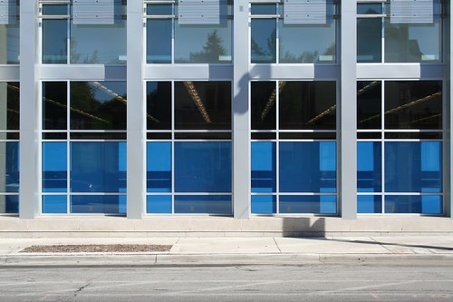
- Someone was clearly hammering a square peg into a round hole. The Oakland Street elevation consists of massive glass windows, which open up the store's interior and allow passersby on the sidewalk an inviting view of....

...the doors to the bathrooms?!
And where are the window displays, which, y'know, are ostensibly the point of having display windows? Windows can also serve to open up the space to the outside, and to bring natural light, but those seem to be verboten under retail rules of conduct, and indeed if you removed the blue panels you'd find yourself looking at the backside of a display shelf.

- There are several nice benches and half-walls to provide space for people to sit while waiting for a bus or whatever else. It's a thoughtful gesture.
- I've heard many people over the years complain about Modernist design, and a couple in regards to this particular building. I perosnally find an unambiguous beauty in this sort of bold massing contrasted with delicate, transparent ornament.
No comments:
Post a Comment