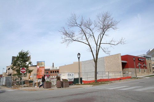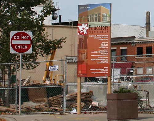
I've heard all kinds of comments about the cornucopia of condominiums that has arisen along Commerce Street. Some people hate the modern designs. Some people hate the sort of people they believe must be moving into them. Some people point out the infamous construction flaws. Some people bemoan the loss of green space along the river.
Many of complaints have some validity. It's unfortunately easy to find concrete spalling and bricks leaching calcite only a year or two after the end of construction. Gentrification is a real problem for lower-income and long-time residents. The Milwaukee River valley is indeed being nibbled away by development that should really have stopped at North Avenue.
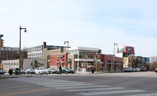
But new condos means more people - more homeowners - living in the city, and that is an indisputably good thing. It's good for the city's tax base, good for the schools, good for local businesses, good for the urban environment in general. Bemoan the condos all you like, but I'd sure rather see people spending their money in RiverWest than Brookfield.
Likewise, I'd rather see this part of the city (this is the city, remember?) built up densely, rather than have the equivalent amount of suburban-style development spread out over open land at Milwaukee's fringes.
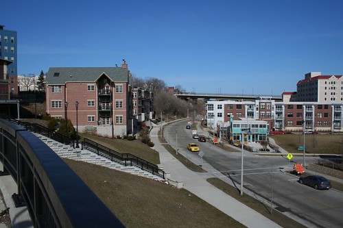
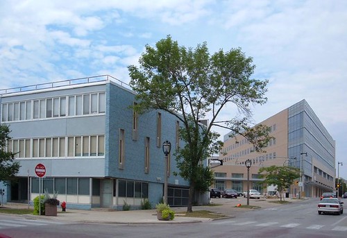
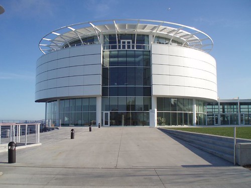
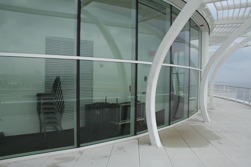
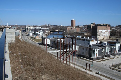
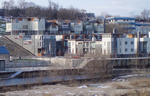
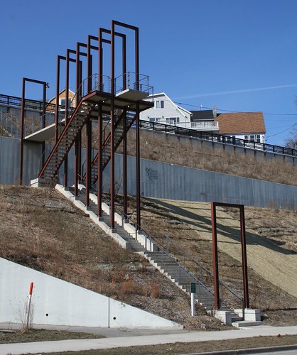
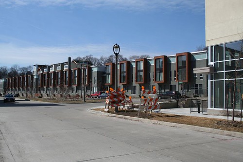
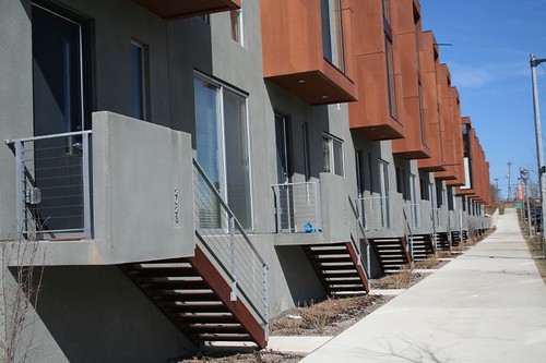
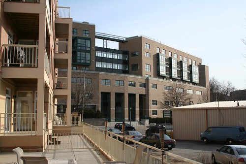
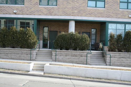
All the new construction has created some dramatic spaces. Commerce Street, formerly the site of some heavy industry and a rail yard, is a narrow slice of land sandwiched between a large hill and the Milwaukee River. The buildings that have gone up here since 2000 climb the hill, bury themselves into it, or perch alongside the river. Courtyards, porches, balconies, stairs and walkways create a layered pile of public and private spaces.
One of the most exciting aspects of the whole development is just how much creative public infrastructure has gone in.
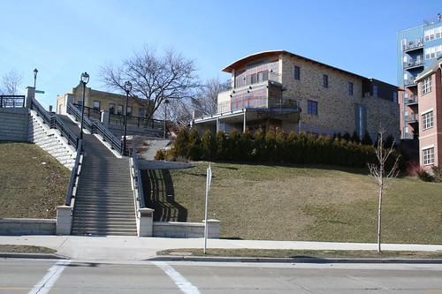
The monumental Vine Street Stairs from Commerce Street up into Brewer's Hill has poetic quotes inscribed on its risers.
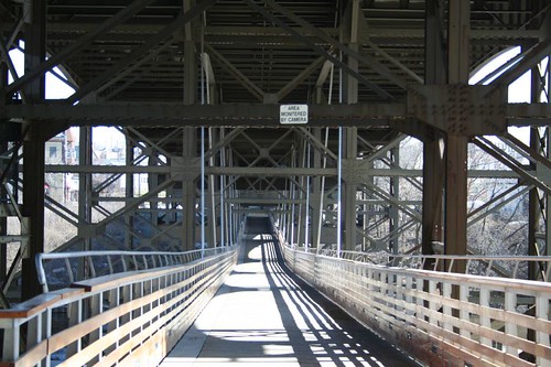
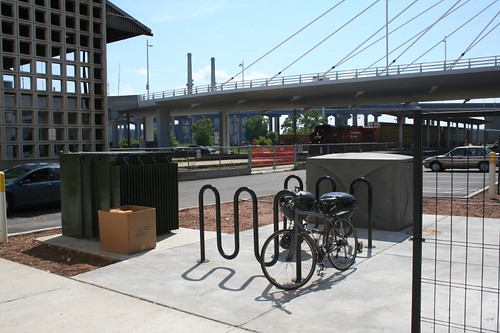
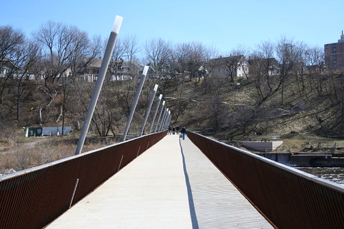
The much-publicized Marsupial Bridge, suspended beneath the Holton Avenue viaduct, is a unique public space. It gives not only a sheltered view of the river and its banks, but also a close-up look at the bridge's massive structure. On wet days, it offers bicyclists a welcome respite from the rain, as well as a handy shortcut from downtown to RiverWest. The gathering space at the east end still seems a little seedy -- even a well-landscaped space under a bridge is still under a bridge -- but has been used for a number of delightful little gatherings, such as evening movie screenings. Likewise, the bridge itself isn't quite as isolated as one might expect; it's much lower to the street and visible that one might expect - though a security camera monitoring one end still gives pause.
The Booth Streets Steps are another shortcut up the bluff to Brewer's Hill. They take dizzying flight into the sky before turning back and descending.
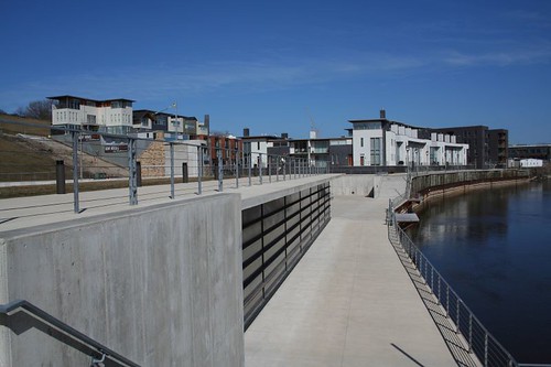
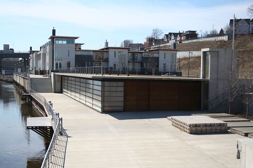
The Milwaukee Rowing Club's new ultra-modern boat storage building stands along the river in a break between two of the condo developments. Its low height allows it to disappear entirely from the street, leaving only the grass-covered roof. At the river, it extends the RiverWalk into a low plaza. That plaza became the site of tragedy in 2004, when two young neighborhood girls drowned in the river while playing on the boat dock. Railings were promptly installed along the RiverWalk in this location, prompting many to wonder why they weren't there in the first place.
The North Avenue Dam, long ago broken to release the river from its captivity, has been put to creative re-use as the base structure for a pedestrian bridge. It connects Riverboat Road to Caesar's Park, a tiny slice of public land including the southeast river bank and the huge bluffs, climbed by a switchback trail. The bridge's style is as modern as the condominiums it serves, with sleek, elegant lamp posts and utterly simple railings.
Caesar's Park was rehabilitated around 2003; after years of being overgrown and potentially dangerous, much of the excess vegetation was cleared out, opening views across the river and eliminating the park's sense of dangerous isolation.
As for the condo buildings themselves, they're quite a mixed bag. Some are forgettable, one or two are rather dreadful, while several are delightful. It's a little heavy-handed to paint them all as sharing much in the way of style; they're all over the map.
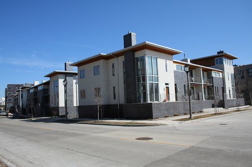
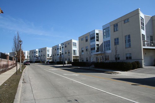
Park Terrace Homes
My personal favorites may be the Park Terrace homes, a long line of identical slender row houses tucked into the hillside. I'm a sucker for marching repetition and shadowy articulation, and the Park Terrace buildings have both in spades.
The facade is a little flat and uninspiring when viewed head-on, but that's not how it's meant to be seen, nor how most people will see it. Most passers-by will see the buildings in profile, and that's where they shine.
More fascinating still, a second layer of houses stands further up the bluff, practical standing on top of the first-phase houses. A new road cut into the bluff leads in from North Avenue, serving both the basement-level garages of the upper houses... and the rooftop garages of the lower houses! The entire scheme is bold and audacious, a fascinating response to a difficult building site. (One hopes they got their civil and structural engineering in order, so the whole thing doesn't start creeping down the bluff or filling up with water every time it rains.)

Not only that, the structures are a rare example of modern development that actually lives up to its name. It actually is a terrace, and it actually is in a park!

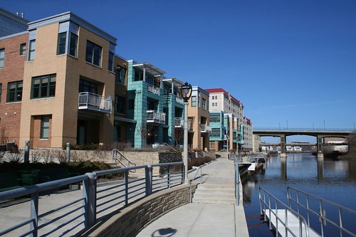
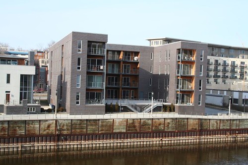
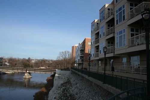
River Homes at Beerline
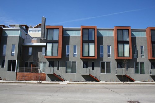
The River Homes at Beerline (see how many names you can squeeze out by recombining "River" "Park" "Homes" and "Beerline"?) line the Milwaukee River, and their terraces extend the River Walk ever closer to its ultimate destination of North Avenue. Sadly, they don't yet connect to the lengthier portions downtown, but hey, Rome wasn't built in a day.
The River Homes are the earliest buildings here, and their modern stylings set the tone for many of the developments that came later. The buildings play with massing and materials; rectangular blocks overlap and intersect, while panels of brick give way to EFIS and wood siding as the buildings rise higher. Transom windows line pseudo-towers that rise above the building's mass at the river.
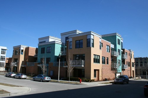
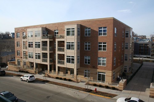
Trostel Square
Trostel Square stands on the site of a former tannery near the western end of Commerce Street. Like River Homes and Park Terrace, the buildings are emphatically modern, clad in a mix of metal panels and brick laid out in patterns that declare the cladding's independence from structure, and massing made of overlapping rectangular prisms emerging from one another.
The buildings dare to use color, mixing light greens and oranges with brushed metal panels and red brick. It's a slightly awkward combination, but it brings welcome relief to what would otherwise be a very monochrome street.
Commerce Bluff
Amid all this unabashed modernism, the Commerce Bluff buildings are kind of a letdown.
Given a narrow site backed up against an insurmountable hill, a tall building was demanded. But the design here doesn't really celebrate that tallness. The gabled roofs seem to be taking a peck at historicism, but they just end up with blandness. A building that should be exciting simply because of its site and height instead is simply... dull.
Union Point
When people comment about how the new condos are "ugly" or whatever other derogatory term they want to use, I always kind of assume they mean the Union Point building. Festooned with tacked-on balconies and saddled with ungainly facade proportions, the building looks like it suffered a head-on collision with a budget shortfall.
I will say this: it has a very impressive profile.
It also adapts to its awkwardly-shaped site, turning a massive block into a block with a twist.
But those balconies just kill the whole thing. They're non-integral to the building in a way that's hard to forgive in a brand-new building, nor do they hold much appeal individually. If they'd been integrated into continuous bands -- as was actually done for the second floor, and again at the sixth -- they'd animate the building, bring controlled pattern and light to its surface, and a sense that the designer remained in control.
River Court
South of Union Point sits River Court, another project that actually lives up to its name: all the units face a central courtyard, which opens up to the river.
Here the intended effect seems to be a big solid cube of gray brick, which has been selectively cut away in places to reveal windows and wood finish beneath. Every element of the building is either "carved" from the mass or seemingly clamped onto it. It's an interesting concept (you see it a lot in architecture school projects) and has been carried out seemingly without compromise. The resulting building is a little hard to love -- it's cool and withdrawn and not terribly exciting -- but it'd hard to dislike it, too, and who can argue with that big courtyard?
RiverCrest Condominiums
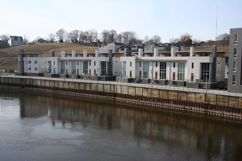
The RiverCrest condominiums are another modern batch. Like the Park Terrace buildings, they are built into a steep hillside along the river. Like the River Homes, they play with massing and materials, piling rectangles high to the sky.
Most unusual on these buildings is the creme-colored split-faced brick. While perhaps intended to be a callback to Milwaukee's famous Cream City brick, for me it evokes nothing so much as the creamy-white brick popular in suburban houses of the 1960s that were shooting for the Camelot-era elegance of the time. Reinforcing that image is the stained wood garage doors.
They also use the same carved-away trick as the River Court building, but to a lesser extent; side walls give way to recessed porches opening onto shared auto courts.
Riverbridge Condominiums
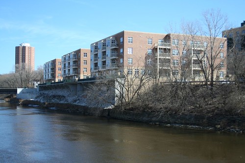
A rather plain bunch is the Riverbridge Condominiums, named for the adjacent Humboldt Avenue bridge over the river. Still, the bay window massing and integrated balconies are nice enough. The most dramatic views, however, come from the outside looking in, where one can see the riverside plaza supported on arching concrete cantilevers over the banks of the river. That terrace space is all semi-public, and perhaps one distant day it will be connected to the rest of the RiverWalk.
Highbridge Condominiums
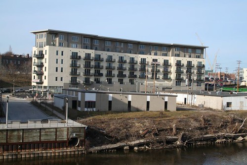
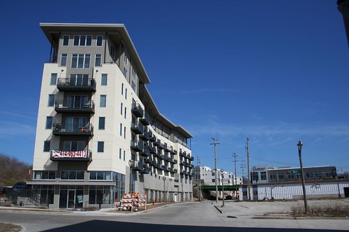
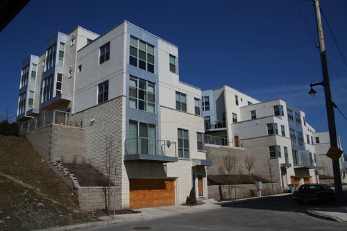
Drama is the order of the day here, as yet another building tucks itself into a steep hillside. The Highbridge condos were the first to go up in this area, and still raise eyebrows with their soaring masses perched precariously on the hillside. There's something fascinating about the bay windows, which read as bits of the building's interior life bursting outwards, unable to be contained.
The building's massing is complex, with different pieces overlapping and saying different things: "grand entry", "quietly domestic", "holy crap I'm flying!"

So steep is the site that the garage entrance is up top, from a dead-end street in the middle of the older neighborhood just north of Brady Street. At ground level, they're friendly enough, though the rest of the street isn't too inviting at present.
Highbridge suffered some rather infamous post-construction problems that led to a lot of lawsuits and misery.
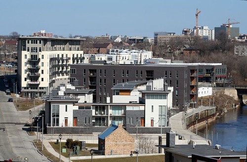
So, yeah, I really like the Valley of the Condos. It's an exciting place, unabashedly new and modern, friendly and welcoming to bikes and pedestrians, with some of the best public space in the city.
Links: