Monday, July 21, 2008

Discovery World

View from the new breakwater

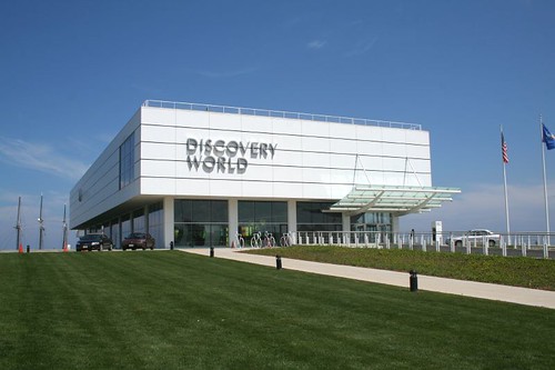
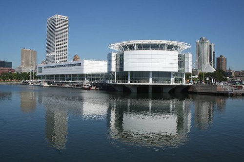
It's hard to argue with the new Discovery World building. From the outside, it's a knockout from every angle. It's a beautiful compliment to the Art Museum addition, without aping it.

I visited Discovery World about a year ago, and got to see how the inside relates to the outside. The building's functions are expressed well from the outside, about... 75% of the way through, I'd say.

Discovery World

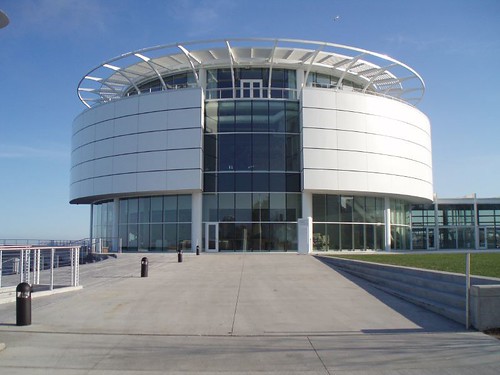
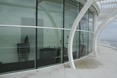
The Headhouse is clearly distinct as a gathering point, a circular structure with balconies at the top. Those balconies surround a ballroom/meeting space, and provide spectacular views of the city, the lake, and the new harbor to the south. An awkward moment does occur when storage space winds up being placed on the outside of the third floor space, complete with windows and a view of the harbor. Oops! It might have been better placed in a block with the elevators nearby -- service functions like that should be grouped; it's a basic rule of thumb. It also emphasizes some of the inherent difficulty of a round building.

Lucky tables and chairs

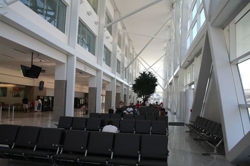
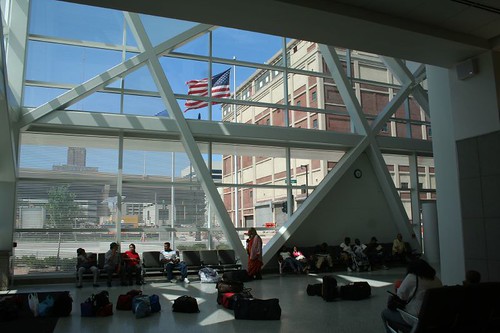
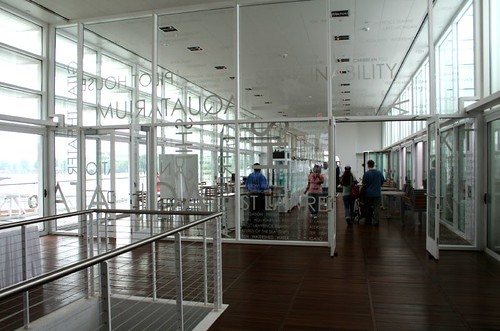
The main body of the building is laid out along a broad, tall corridor lined with windows facing the bay to the south, an attractive and open space that provides easy orientation.

The glass tube

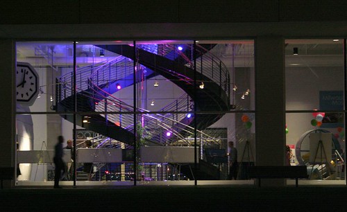
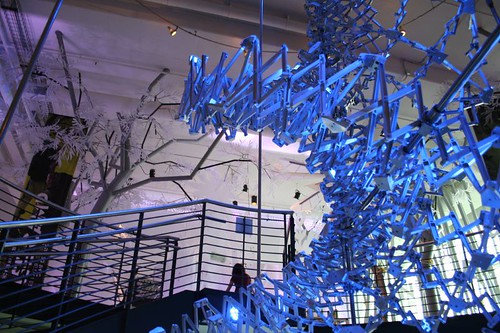
At the end, one turns right and enters the primary exhibit space, which is dominated by a double-spiral staircase with an elaborate moving model in the center. A window wall to the north provides continued orientation, and creates a delightful view of the colorfully-lit model by night.

Glowing in the night

Discovery World

Past this point, however, clarity starts to fall apart. A second room on the first floor kind of dead ends. The main room on the second floor is a bit chopped up by its exhibits, with no clear main circulation path. Classrooms and other interactive areas are accessed through an odd hallway that makes one hesitate to proceed, uncertain if they're headed toward a mock TV studio, the corporate offices, or the boiler room. It was at this point that I got the impression that this portion of the building had been designed from the outside in, rather than allowing the functions to generate the plan, and the exterior form to follow from that.

Some of the second floor exhibits were still under construction when I visited, so it's possible things may become more clear with time. Some bold signs would have gone a long way toward clarifying what was where.

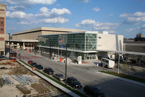
Outside, the building and its grounds succeed brilliantly. What was once a completely forgettable section of the lakefront is now fully integrated with the parks and museum to the north, and the newly-opened Lakeshore State Park and the Summerfest Grounds to the south.

Facing the new harbor

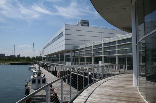
The building's water-facing sides are wrapped with cantilevered walkways, offering exciting views of the new harbor and the lake waters to the south. The walkways hook up with a new breakwater with attached docks and a small connected amphitheater. The amphitheater faces a new dock for the sailing ship Dennis Sullivan. It's a brilliant expansion of Milwaukee's already-magnificent lakefront, and adds a worthy attraction to the lakefront's offerings. In light of that, a few architectural flukes are pretty negligible.

Discovery World

Wednesday, July 16, 2008

Amtrak Station burdened by junk

Amtrak station

I recently visited the spacious new waiting room of Milwaukee's remodeled passenger depot. Perhaps "depot" is a poor choice of words, because the building no longer treats passengers like cargo. The dark and minimal waiting area has been replaced with a vast, bright and airy space.

The Waiting Room

As a consequence of the narrow space available for the expansion, the waiting room features a strange set of proportions. It is as taller than it is wide, and very long, running uninterrupted for the 300-foot length of the building. The pick-up-sticks wall of angled steel box beams begs to be beheld from a distance, to be appreciated in its entirety, but it's not quite possible with the room's narrow width.

Still, it is an airy and comfortable space, open and inviting, big but not overwhelming, much like Milwaukee itself. The white color continues a trend started by several of the city's most prominent new structures: the Art Museum addition, the 6th Street viaduct, and the new Discovery World building.

Functionally, the space breaks up into three parts. The western half is used for Greyhound passengers; chairs ring a large open area. The center portion is a general dining/communal area, designated by three tall trees and round tables. The eastern half is for Amtrak passengers, and is marked by multiple rows of chairs.

The Window Wall

This is not a pristine space; it is of course meant filled with chairs. Several large potted trees enliven the center of the space, breaking up the room's endless length. And the crazy-quilt structure of the window wall itself suggests some of the chaos naturally associated with travel. Yet there is something clean and crisp about it, and I was disappointed to find that the management has seen fit to clutter the entire space with junk.

Junk

More junk, and soda.

Much of this detritus was clearly not planned for, and was added after the fact. That monster game machine really should have its own dedicated space, in a game room somewhere (it makes a lot of noise as well, disturbing the peace of everyone waiting to travel.) And while trash cans and ATMs are necessary accoutrement of everyday life, there are ways to deal with them more elegantly than to jam them up against every available column.

One of those ways, for example, is to provide a dedicated alcove for objects like vending machines. It's not beautiful, but at least it gets them out of the way. And it seems that someone had this in mind... but somewhere in the planning process, the fact that vending machines require electricity wasn't accounted for. And thus, while an alcove big enough for twenty soda machines does indeed line the south wall of the waiting area, it's empty, because there's nothing to plug the machines into.

Connect the dots

Instead, they cluster clumsily around the ends of the alcove, butting out into the concourse area, not only looking ugly in their own right but giving the space the sort of ad hoc messiness that really shouldn't be present in a freshly remodeled building. Even allowing for the mistake of not including enough outlets, one would think that fifty dollars would be available to pick up a couple of extension cords and get the machines into the alcove where they belong.

And more soda.

Attempts to lure a full-time restaurant to the station have not met with much success, but with this phalanx of vending machines, the station already has the equivalent of a small 7-Eleven.

My one other criticism with the station's interior pertains to the Greyhound end of the waiting area. Travel by Greyhound is a catch-as-catch-can affair; one must wait in line to be assured of getting a spot on the bus. To that end, passengers typically use their luggage as a stand-in so they can sit while waiting. The open space of the waiting area serves this need adequately, providing plenty of seats surrounding the luggage line-up that allow passengers to keep an eye on their bags. Yet it remains a chaotic solution, and I wonder if other, more elegant alternatives were explored (integrating the line with the waiting room chairs, for example, or a numbering system.)

Outside, it took a little bit of searching to locate the bike racks. They're tucked away behind the Greyhound boarding area on the building's west end, out of sight from the road (and nearly everything else.) I'm not sure how I feel about the arrangement; while it doesn't advertise the presence of locked bikes to passersby, it also doesn't seem to be a very well-watched area.

Hidden bike racks

The bike racks are correctly installed, with plenty of room on all sides, and they are the multiple-U racks which are ideal for parking any type of bicycle. Having any racks at all is a great step up from the state of affairs during the renovation, and I do appreciate that bicyclists were given this thoughtful parking arrangement.

Criticisms aside, the new waiting area is a welcome addition to the Milwaukee traveling experience. Hopefully the building's management will soon relocate some of the clutter that's currently dragging down an otherwise pleasant and modern space.

Tuesday, July 08, 2008

Pritzlaff Hardware Building

Just across the river from the 3rd Ward is this monster of a building complex. The original two portions, with their endless marching windows and bays, were begun in 1875 as the Pritzlaff Building.

Pritzlaff Hardware Building

The building originally held a hardware company that, in time, became Milwaukee's largest. The enterprise was begun by John Pritzlaff, a Prussian immigrant who arrived in Milwaukee in 1841. In 1850 he started his hardware company, which would eventually become one of the largest in the Midwest, employing some 400 persons at its peak.

Leaving its original home on 3rd Street (still extant today), the company moved south to a site with railroad and river access. The new building was designed by John Rugee. The center portion of the east facade, dated 1875, came first; the corner portion to the north was likely the next addition. Overall the building was expanded at least three times, in 1916 among others, into a 300,000 square foot complex.

Pritzlaff Hardware Building

Pritzlaff's son Fredrick would continue as president of the company until 1951; Frederick's son and grandson also entered the business. However, by then the company was in decline; it closed its doors in 1958.

The buildings then became home to Hack's Furniture, who applied their own painted signs to its vast walls of Cream City brick. Hack's closed in 1984, but a family-owned storage business moved into the building.

Pritzlaff Hardware Building

The buildings were most recently occupied as a furniture store (The Mattress Store) and for storage, but have been largely vacant and underutilized for years. By 2000, the building was under consideration for conversion into a residential space, but no developers were willing to step forward, daunted perhaps by its considerable size.

Six years later, however, Sunset Investors got the ball got rolling on a massive renovation, cleanup, and remodeling. The building is now being converted to a mixed-use project, including 86 condominiums, retail, office space, and a new parking garage that has yet to be built. The project is being overseen by Brookfield design firm Cityscape Archtecture.

The renovation has cleaned the public faces of the building, washing away heavy layers of grime and soot accumulated in its 130-year history. The change is remarkable, letting the building's architectural beauty shine through unblemished.

Pritzlaff Hardware Building, spring 2000
East elevation in March 2000

Pritzlaff Hardware Building, summer 2008
East elevation in June 2008

While the renovated facades look unquestionably great, it is still a bit sad to see the building's physical history scrubbed away, losing the appearance of a building unaltered for a hundred years. The building has also lost the 1950s painted signs from the Hack's Furniture days.

Pritzlaff Hardware Building
North/west elevations, July 2005

Pritzlaff Hardware Building
North/west elevations, July 2008

Various painted signs for Pritzlaff Hardware remain on the back of the building at present, though the renovation may claim them as well. Some are over a hundred years old; it would be an unfortunate loss.

Pritzlaff Hardware Building
Above: a painted Pritzlaff Hardware sign on one of the original buildings was partially covered over by a western building addition.

The building's street facades are nothing short of remarkable. The various additions over the years are unified by their Cream City brick construction, and range in style from ornate Italianate to the largely unadorned 7-story addition to the south. An amazingly long line of windows marches down the Plankington Avenue side, beautifully rhythmic, their sheer number hinting at the heights of prosperity and money that drove the building's owners.

3rd Ward Multiples II

The building is remarkably well preserved, its cornice and Italianate brackets unaltered since their original 1875 construction. It street level storefronts are likewise virtually unaltered; the renovation has removed the various ad hoc alterations that did accumulate over the years, leaving a clean and lovely street facade.

Pritzlaff Hardware Building

Seeing this building renovated and on its way back to life is nothing short of uplifting. In its sheer size and power, it is one of the city's most remarkable structures.

Pritzlaff Building