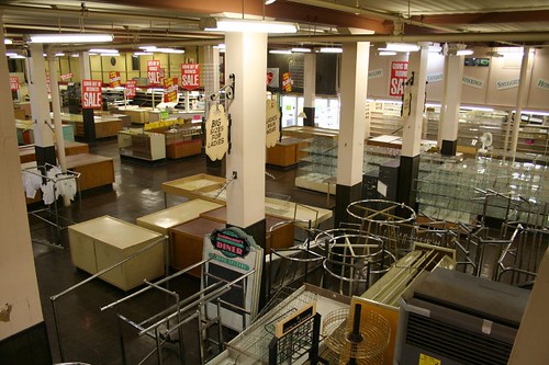
Today was the final day of business for Goldmann's Department Store. Though the store was virtually empty of goods and wares, the lunch counter was packed throughout the day. At mid-afternoon, a crowd gathered to hear words from Mayor Barrett, the store's current and future owners, and neighborhood representatives.

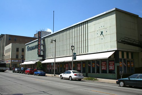
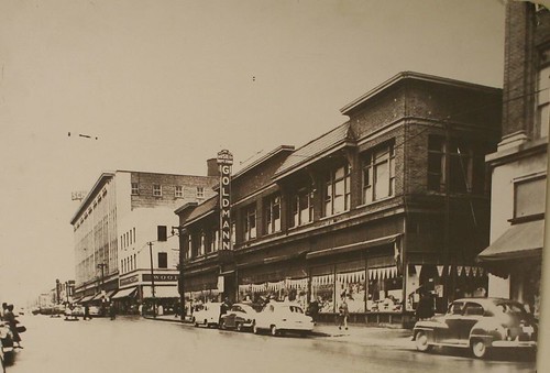
Among the words of bittersweet reminisce and optimism that the building will continue as a place of commerce and communal gathering was a statement regarding its architectural future. The building will be remodeled inside and out, with the exterior being returned to its 1920s appearance.
I think it's a big, big mistake to do this.
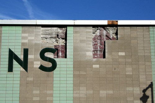
Exploratory work has been done on the west elevation, removing some of the CMU coverup facade to see what remains of the older building beneath. From what I can gather, it looks like there might actually be two older facades underneath the 1950s coverup, one on the west side dating from the building's original construction (a strongly Victorian composition in red brick) and a circa 1920s reworking on the Mitchell Street side in brown brick. From the looks of what's been exposed, none of what remains is in particularly great shape, and a lot is missing. It can certainly be repaired, but it's going to be a lot of work.
But the end result will be undistinguished. Not that the building itself will necessarily look bad, but it will simply be more of what we already have lots of in Milwaukee. Brick Victorian commercial buildings are a dime a dozen in this town. Heck, there's a brown brick Chicago School building right next door.
The kind of bold, slightly campy yet unabashedly Modernist facade that has adorned Goldmann's for the last fifty years, however, is a vanishing rarity in Milwaukee. When this facade is wrecked, there won't be another one like it in the city. It is a unique creation, and its demolition is no less an architectural tragedy than the demolition of 19th century buildings is.
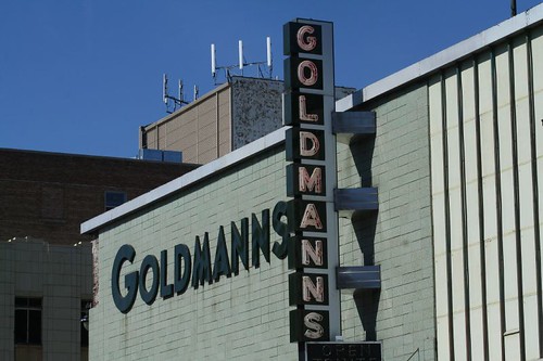
You want historical value? Nobody born after 1945 is likely to even remember the way the store used to look. For most Milwaukeeans, Goldmann's current appearance is simply how the store has always been.
Does it fit with its surroundings? Well, exactly which surroundings are we talking about? The Beaux Arts detailed Schuster's building? The Deco building next to that? The wood-framed gabled buildings with Flemish curved facades? Maybe the 1960s Modern bank across the street? Mitchell Street is a riot of architectural styles, both high and low, each one contributing to the street's visual vitality. Removing its premier 1950s entry will not enliven it, but make it more bland.
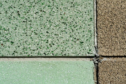
Is the facade bland and boring? Not at all. A close look rewards the viewer: the facade uses several different kinds of CMU, two of them tinted, one with ground glass embedded in it. Metal panels cover another portion of the facade, with a minimalist clock (sadly nonfunctional) at one end. A marching row of metal rods sits in front of this portion, offering an endless play of shadows as the sun moves across the facade. Details include the clock, the shiny aluminum and neon sign, and the bold lettering on the western facade.
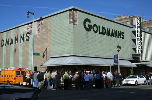
People gathered today to lament the loss of an institution. Yet the loss of its physical embodiment was treated as cause for celebration. I'll say it again: in twenty years, people are going look at the heritage of the 1950s, and wonder why the heck we didn't save any of this stuff.
6 comments:
I just wanted to say that I really like this blog and I learn a lot from reading it. Thanks.
I am very very unhappy to hear this news. Why can't they just gut the interior, why ruin the exterior? A sad day for Milwaukee. I doubt the renovation of the old building will even be that detailed.
I agree, what they plan is a mistake. The building is as unique to Milwaukee as is the hair on my head.
But having seen Michel St. on my last visit this does not surprise me.
I'll never understand why sales like this happen. Why not let someone who enjoys the 50's design purchase the building. Those who don't can look across town.
I bet they want to restore it to the older facade because back then the building had windows. It is hard to lease space without a view outside and the 1950's facade did a good job of getting rid of any views.
I really miss Goldmanns. I am only 26 years old & I have so many memories of this place. It was my first job when I was 16. My parents knew the owners since way before I was born. I used to sit at the counter with my parents (and late father) as a child and have a meal with them. I still remember when Woolworths was next door. It shocks me how so much has changed since even the 80s. The neigborhood has become so wore down. I see all the renovations they do to make a quick buck building condos, bars, and restarants all over Milwaukee. Its sad no one stood up and renovated Mitchell Street, kept Goldmanns, and kept its historical value to so many people. It was a sad day when I heard they were closing & turning it into a shoe store. I knew it would become just like the "mall" next door (if thats what you want to call it). Well, for so many of us we will have our memories of such a blissful place, great "old fashioned" customer service, and the hope someone would invest in such a great cause to keep our historical value to places we grew up in alive.
Thank you for writing about Goldmanns.
Post a Comment