But first, a topically related preservationist lament:
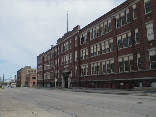
At the intersection of W. Bruce Street and S. 4th Street, where the massive Bradley Tech High School once stood, remains nothing but an empty field of mud.

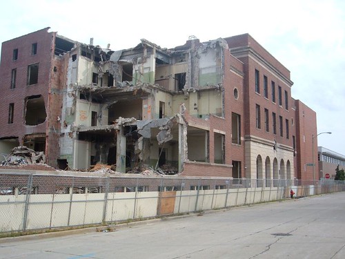
I was disappointed that nothing was preserved from this building, which came down in 2006. In particular, the west entrance formed a brilliant termination to Bruce Street, a grand civic statement now lost and not guaranteed to be recovered in whatever eventually takes shape on the site.
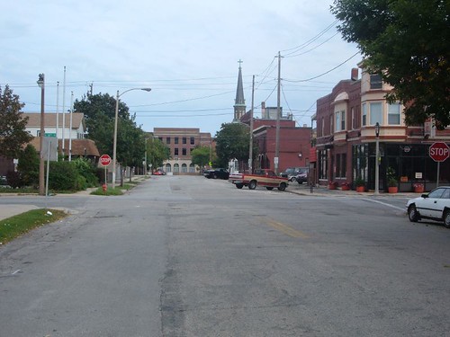
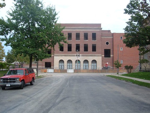
The old building was an enormous structure, built in several stages beginning around 1906 as Boys' Tech, and filling more than a city block. It was intimidating but grand; built in sections as it was, surely some of it could have been gutted and reused. The site as currently planned will serve as athletic fields for the school.
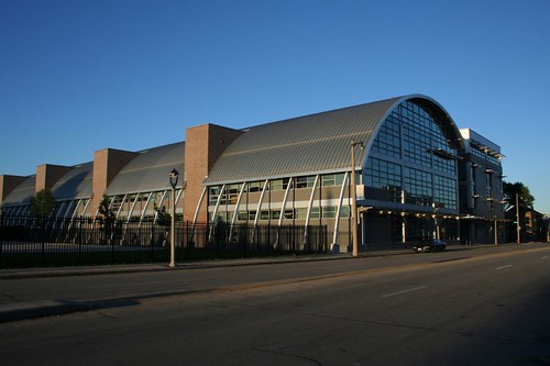
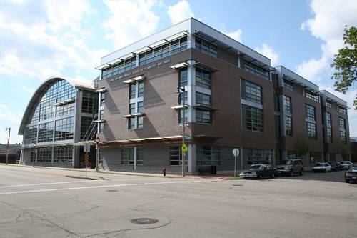
The new Lynde and Harry Bradley Technology and Trade School, meanwhile, sits immediately to the south, facing W. National Avenue betweeen 3rd and 4th Streets. The building consists of a round-roofed section, flanked by two more standard box-shaped wings. It is seductive with its strong forms and shiny materials. However, I was rather confused by what I could make out of the interior.
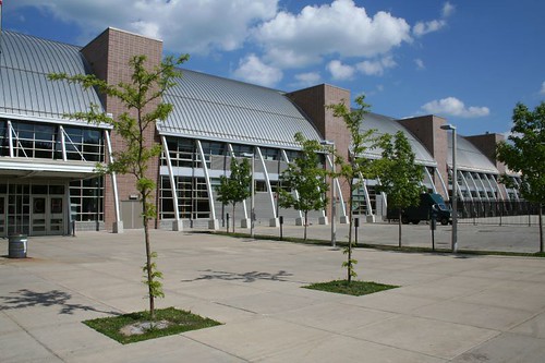
The exterior of the building is a classic Modernist Big Idea: we're gonna make this thing a half-cylinder, lying on its side, intersected by a series of vertical masonry cores. It's bold, it's powerful, it's iconic. Ordinary buildings are based on a floor plan which is then extruded vertically, but this one's a giant hoop, extruded horizontally. That's the Big Idea, the image you see from the street before you ever set foot inside. The result of that idea is that the building should be sectional -- elements that occur at one end should carry through the length of the building. The curve of the roof should provide the basis for orientation throughout the building. However, from what I could see from the outside, the building doesn't seem to work that way.
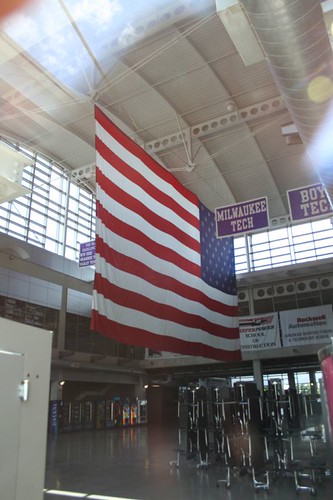
One end of the cylinder has a massive open atrium, the width of the building. This portion does indeed take full advantage of the building's iconic shape, with the curved roof exposed high above the entry doors, and a massive wall of north-facing glass filling the space with light.
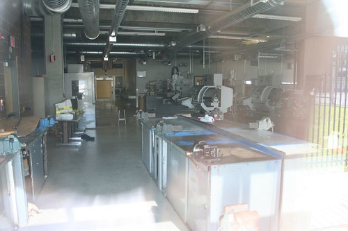
But south of that, it's solid labs and workshops (and, presumably, corridors.) The raw metal cladding of the cylinder ends before it reaches the ground, leaving a narrow exterior passage framed by curving structural members, but this is the only sectional element I could discern from the outside. Viewed from the inside, the Big Idea gets lost.
What else could have been done? Historically, a big, odd shape like a cylinder denotes a large open space -- a gymnasium or an auditorium (or an atrium). Curves are odd shapes -- computer age or not, we still live in a world of orthogonal construction. So you don't want to have to cut walls off to meet them or have glass made to fit their varying profiles. You wanna enclose it once and not touch it again. And the curve is a special shape, so it should remain visible; you don't want to bury it under a dropped ceiling.
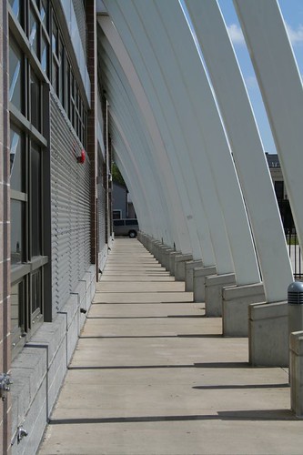
So, the building could have been designed as a "building within a building" -- classrooms pulled back from the exterior skin, window walls along the classrooms allowing outside light to filter in, mezzanine balconies replacing typical hallways (enclosed in glass, of course, since the last thing you want to give a bunch of high school kids is the irresistable chance to drop things on their classmates three stories below), all of it opening onto a multi-story windowed west wall. Let that strange curved roof play through on the inside as well as the outside.
Why didn't it play out that way? Could have been any number of reasons. Big atriums require a bigger building. Big buildings cost more money to build, maintain, cool, and heat. But if that ended up being the case, why use a form that screams out "sectional building"?
Some of the oddness also comes to light in the meeting of the cylinder with its two adjoining wings, which are both more traditional in form.
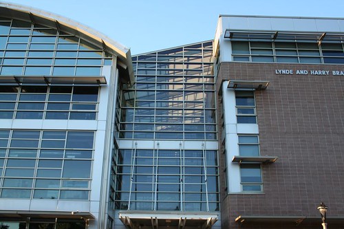

I may be coming down a little hard on this building. Compared to about 95% of the blobby nonsense that's hyped up in the glossy magazines these days, it's utterly practical, and unlike a lot of ultra-modern glass containers, it does have a strong visual identity, a sense of form and mass. Without that cylinder, the building wouldn't be nearly as memorable. But it does seem to suffer from a similar problem as the blobs, wherein a sexy shape is selected for the outside, and then the inside is compelled to fit within.
No comments:
Post a Comment