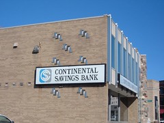
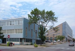
These two are very symptomatic of the inattention paid to Mid-Century Modernism in this day and age. Five years ago when I moved here I wouldn't have given either one a second glance. Now I look and see unique, creative designs, beautiful details, delightful colors and materials. They're quiet and unobtrusive until you look closer... well, as unobstrusive as a blue building can be, anyway.
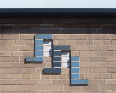
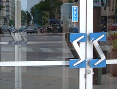
The Continental Savings Bank features a grand corner entrance that wonderfully acknowledges its location on a major East Side intersection with a wall of rough rounded stones, which curves away to provide a mini-plaza space. Something once stood in front of the entry -- a fountain, perhaps, or a bench and flagpole. Sharp details include the hyper-stylized door pulls, the glazed brick logo on the west side of the building, the limestone cornerstone, and the triple mullions at the windows.
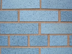
A block to the east stands a building sheathed with a distinctive blue brick; it was until recently the Prospect Medical Clinic. The blue brick building lacks the grand statements of the bank, but the unusual brick and the offset window patterns on the east and west walls make it noteworthy. Silver racing stripes form decorative patterns on several of the first floor windows and doors.
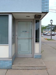
With the clinic's closure (perhaps due to the consolidation of Columbia St. Mary's across the street), a sign has appeared on the building advertising the land as being available for redevelopment. With a long-vacant gas station right next door and a parking lot behind, there is a strong chance the building's future is in doubt. Developers are no doubt salivating over the prospect of combining all three parcels and replacing them with a single large building in this lucrative location.
2 comments:
Seriously, this is one of the worst buildings in Milwaukee. Even your careful detail shots can't hide the truely, non-urban response to the intersection and public face of North Ave. I walked by this building hundreds of times before I realized it was not abandoned. -annette
I disagree completely. The entrance faces the corner, as it should. The corner is carefully and deliberately responded to with a micro-plaza that invites one into the building. The building in turn is shaped by the plaza, responding very directly to the intersection. It's built out to the sidewalk on both faces. It's two stories tall.
With its parking behind and drive-through on the north side, it's not exactly the model of urbanity, but it's definately not "non-urban" by any means.
Ref: A wider shot.
Post a Comment